

Table of contents
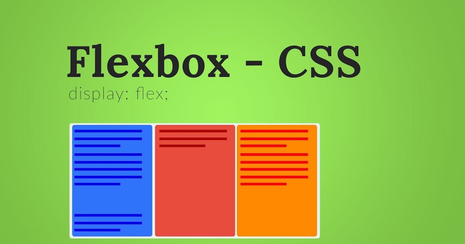
Hello everyone, So I'm back with another article that will tell you about CSS-Flexbox in a detailed and understandable manner, so let's get started:-
What is FLEXBOX ?-
A Flexbox in simple, Flexible layout method is a layout tool that helps you in arranging items inside a container in rows and Columns. It is a very helpful tool for designing layouts as we can arrange our content in any way without using Float and Positions which are often very confusing to deal with.
Why do we use Flexbox?
It allows us to align items and distribute space among items in a container.
It provides flexibility to fill the available space.
In Flexbox, items can Shrink or Grow according to the size of the screens.
It is an easier layout method to design a flexible responsive layout without using float and positions.
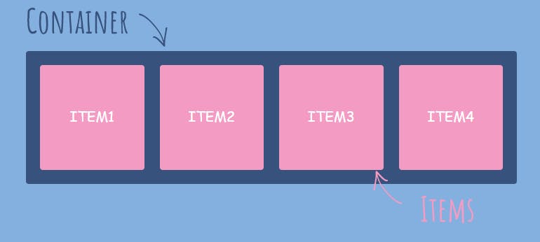
To understand Flexbox better we need to make clear what the container and the items are. So, let's understand this-
Flex Container:- A Flex-container is a container that acts as Flexbox and it contains the Flex-items inside it.
Flex items:- Flex-items are the immediate Children of the Flex-container.
SYNTAX
  .container {
  display: flex;
   }
The flex-direction property is how we set the direction of the main axis. Other values for flex-direction are:
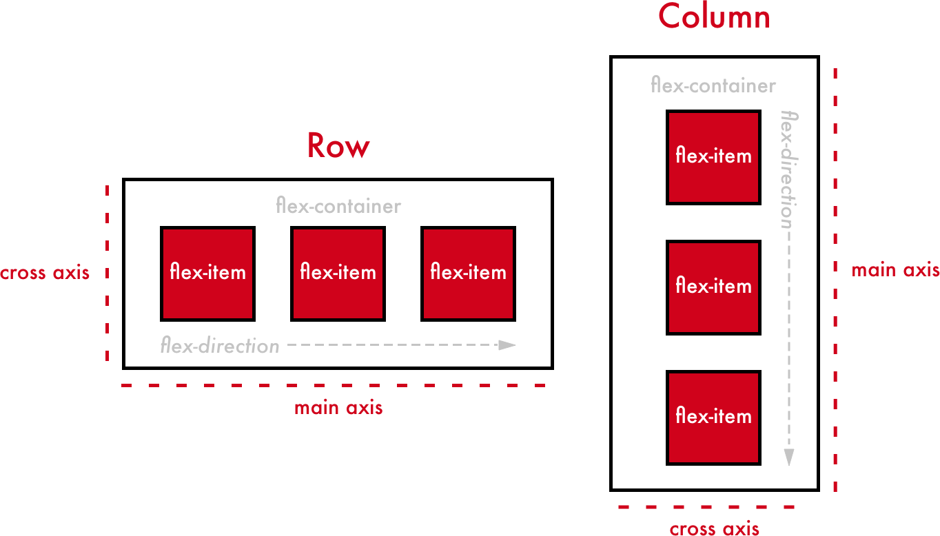
Main axis and Cross Axis:-
By default the flex-direction is always row, so the main axis is always horizontal and the cross axis runs perpendicular to it. But we can change it by defining the flex-direction property.
If we set the flex-direction as row the main axis will be horizontal and the cross-axis will be vertical and if we change the flex-direction as column the main axis will be vertical and the cross-axis will be horizontal.
FLEXBOX Properties
Flexbox properties are basically classified into two parts-
1.Flex-container Properties
2. Flex-items Properties
so let's first grab flex-container properties in detail-
Flex-Container Properties
These properties applies only on the Parent Container. These are as follows :-
Display Properties
Display:flex It is similar to the block-level elements. It covers the whole space or the available width.
     .parent{
      display:flex;
       }
Display:Inline-flex It is similar to the Inline-level elements. It covers the whole space according to the content it wraps.
    .parent{
      display:inline-flex;
      }
Flex-direction Properties
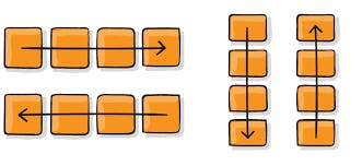 Flex-direction: row
Items in the Container will be from left to right.
Flex-direction: row
Items in the Container will be from left to right.
Flex-direction:Column Items in the Container will be from top to bottom.
Flex-direction:row-reverse Items in the container will be from right to left(Opposite to row).
Flex-direction:column-reverse Items in the container will be from bottom to top(Opposite to column)
Flexwrap Property
Flexwrap:Nowrap It is the default value ,it makes no changes.
Flexwrap:wrap Items will be wrapped and automatically break into new lines if the container has no space to accommodate in a single line.
Flexwrap:wrap-reverse It will wrap the content in the opposite direction.
Flexflow Property
It is the shorthand property for flex-direction and flex-wrap. Here, the first value is of the flex-direction and the second value is of flex-wrap.
       .parent{
       flex-flow: row wrap
        }

       .parent{
         flex-flow: column wrap
        }
Note: The shorthand property is the property that includes more than 1 property so that we don't have to write so many properties again and again which is always very inconvenient. and It is very easy to use this one property instead of using too many properties.
Justify-content Property
-The Justify content property will tell us how the items will act on the main-axis.
-It controls the alignment of items on the main-axis.
-It helps us to make use of extra space leftover in a container.
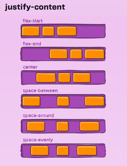
Justify content:Flex-start Here all the items will start from the edge(starting point) on the main axis.
Justify content:Flex-end Here all the items will be laid out towards the end point on the main axis.
Justify content:center It will center all the flex-items on the main axis line.
Justify content:space-between It will create space between all the items leaving no space on the edges.
Justify content:space-around It will create space between all the items along with the space on the edges.
Justify content:space-evenly It will create even space between all the items along with the space on the edges.
Align items Property
-Align item property works on the cross axis.
-To apply align-items property it is necessary to give the container a definite height.
-This property is quite similar to justify-content but works on cross-axis.
-It defines how the flex-items will be laid out on the cross-axis inside a flex-container.
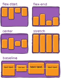
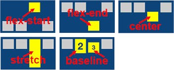
Align-items:stretch It is the default value, all the flex-items are stretched on the cross-axis to fill the extra space in the container.
Align-items:flex-start All the items align from starting point on cross-axis.
Align-items:flex-end Here all the items will be laid out towards the end point on the cross-axis.
Align-items:center It will center all the flex-items on the cross-axis line.
Align-items:baseline The baseline value aligns items based on the baseline of the text.
Align Content property
It also works on the cross-axis. It has the same values as of align-items property. It is compulsory to have *multiple columns to use this property.
Flex-items Properties
These properties need to be applied on the flex-items inside a flex-container. These are as follows :-
Order
-This property is used to re-order the flex-items without changing the source code in an HTML document.
-This property accepts Unitless value in number i.e, 1,2 etc. it can be positive as well as negative.
-By default, every item has 0 value for the order property.
-The items are recorded from the value lowest to highest.
- order valueitem will be at starting.
+ order value item will be at the end.
Flex-grow
-It allows the item to grow(expand) if there is extra space inside the flex container.
-It doesn't accepts the negative values.
-By default, the value for the flex-grow property is 0, which means the size of the item will be auto.
-This property wraps the whole space equally.
Flex-shrink
-It allows the items to shrink if there is less space inside the flex container.
-By default, the value for the flex-shrink property is also 0, which means the size of the item will be auto.
So, let's understand these both through this example-
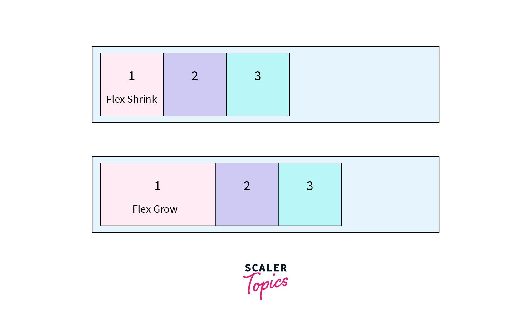
     .box-1{
      flex-grow: 2;
      }
Here, in the given picture there are a few boxes. After applying flex-grow:2;to box-1 , we can see that box-1 has 2 times more space than the other boxes.
and now since the box-1 is 2 times bigger than other boxes we can apply flex-shrink to gain back its original size.
     .box-1{
      flex-shrink: 1;
      }
Flex-basis
-It is a limit only after which the items will start to shrink while reducing the size of the screen by inspecting.
-By default, flex-basis value is 0.
-We can use flex-grow and flex-basis at the same time. By this our elements will grow and shrink in correct manner.
    .box-1{
    flex-grow: 2;
    flex-basis: 400px;
    }


    .box-2{
    flex-shrink: 3;
    flex-basis: 400px;
    }
Flex
It is the shorthand property for flex-grow and flex-shrink and flex-basis. Here, the first value is of the flex-grow and the second value is of flex-shrink and the third is of flex-basis.
   .box-1{
    flex: flex-grow flex-shrink flex-basis;
    }

   .box-1{
    flex: 2  1  400px ;
    }
Align-self
-It is similar to Align-items property but it works on the flex-items only.
-Auto is the default value here.
   .box-1{
   align-self: auto;
    }

  .box-1{
   align-self: stretch;
    }

  .box-1{
   align-self: center;
    }

   .box-1{
   align-self: flex-start;
    }

   .box-1{
   align-self: flex-end;
    }

   .box-1{
   align-self: baseline ;
    }
NOTE: To all the properties that work on the cross-axis it is compulsory to define theflex-direction as column.
**
THANK YOU FOR YOUR TIME!
Did you enjoy reading it?
If you loved it please share your thoughts on this.