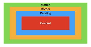
What is the Box Model?
According to this model, every element is a rectangular box on a page and it may have some width, height, padding, border, and margins. The Box Model describes how the padding, border, and margin are added to the content to create this rectangle.

Content
The innermost rectangle is the content box(Red). The width and height of this box depend on the element’s content (text, images, videos, etc ).
Padding
After the Content box, there is a padding box(Sky blue), which is defined by the padding property.
Syntax
.box{
padding-top:15px:
padding-bottom:25px:
padding-left:10px:
padding-right:5px:
}
Shorthand Property
padding: top&bottom left&right;
.box{
padding: 5px 15px;
}
Border
After the padding box, there is a border box(Orange), which is defined by the border property. Syntax
.box{
border: 2px solid black;
}
Sometimes we want to apply border on some specific side in some definitepx so we apply like this:-
.box{
border-top:5px:
border-bottom:2px:
border-left:1px:
border-right:5px:
}
Margin
The outermost rectangle box is the margin box(Green).
Syntax
.box{
margin-top:15px:
margin-bottom:25px:
margin-left:10px:
margin-right:5px:
}
Shorthand Property
margin: top&bottom left&right;
.box{
margin: 5px 15px;
}
Box-Sizing Property
- By this, We can change the default Box-model Property.
- It allows us to change how the Box model works and how an element's size is calculated.
Content-Box
- It is the default value.
- By default in the Box Model, the width and height you assign to an element are applied only to the element’s content box.
- The width and height for an element will not represent its actual width or height on screen as soon as you start adding padding and border styles to the element.
- It keeps Borders, Margins, and Padding as additives.
Here, the measurement doesn't remains the same.
.box{
box-sizing: content-box;
}
EXAMPLE
Here, If we provide -
Width= 250px
Height= 150px
padding= 5px
margin= 10px
Border= 2px solid black
Then, Actual Width =[ width + padding (Left & Right) + margin (Left & Right) + border (Left & Right) ]
=[ 250 + (5+5) + ( 10+10) +( 2+2) ]
= 284px
Actual Height=[ height + padding (top & bottom) + margin (top & bottom) + border (top & bottom) ]
=[ 150 + (5+5) + ( 10+10) +( 2+2) ]
= 184px
Conclusion Here, In content-box we can see that the Borders, Margins, and Paddings, all get added in the main width and height. Hence the measurement of the box doesn't remain the same and after adding all these properties the size of the box increase due to an increase in the main width and height.
Border-Box
- It keeps the Borders, Margins, and Paddings within the specific width and height.
- Here, the measurement remains the same.
.box {
     box-sizing: border-box;
      }
EXAMPLE
Here, If we provide -
Width= 250px
Height= 150px
padding= 5px
margin= 10px
Border= 2px solid black
Then, Actual Width =[ width - ( padding (Left & Right) + margin (Left & Right) + border (Left & Right)) ]
=[ 250 -( (5+5) + ( 10+10) +( 2+2)) ]
= 216px
Actual Height=[ height -( padding (top & bottom) + margin (top & bottom) + border (top & bottom)) ]
=[ 150 -( (5+5) + ( 10+10) +( 2+2)) ]
= 116px
Conclusion Here, In border-box we can clearly see that the Borders, Margins, and Paddings, all lie within the main width and height. Hence the measurement of the box remains the same as We've provided it even after adding all these properties.
Box-Model Table
By this table, we will be able to differentiate whether these properties will apply on these block or inline-level elements or not, and if yes then in which way-
| Properties | Block-level | Inline-level | ||||
| Width | Yes | No | ||||
| Height | Yes | No | ||||
| Padding | Yes | Left and Right | yes | Top and bottom | Blend | |
| Border | Yes | Left and Right | yes | Top and bottom | Blend | |
| Margin | Yes | Left and Right | yes | Top and bottom | No |
